To the choice of the designer, the owners of this apartment approached responsibly: they studied the work of Natalia Komova and met her even before they formalized the documents for housing. “I like this approach, it’s better than recommendations and word of mouth,” Natalia admits. – It is immediately clear that the taste preferences of customers coincide with mine, which means that the project will be implemented consistently and without changes. ” So it happened.

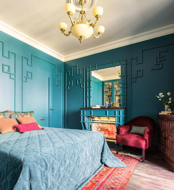
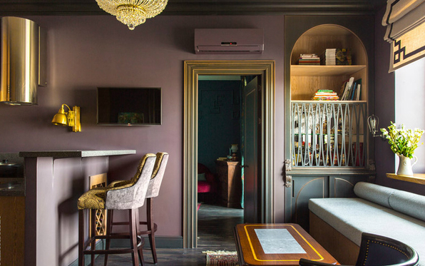
The space with which the designer had to work was square, with three windows and an open layout. The space for imagination was limited only by an area of 65 m². Customers (a married couple with adult children who live separately) needed an apartment adapted to receive a large number of relatives and friends, but at the same time with separate personal zones. Having at his disposal a small living space, the designer solved this problem in the following way: she combined the kitchen with the living room, making this room passable. On the one hand is the master bedroom, and on the other – the office. It visually adds space to the living room, because it is separated from it by a wide and high opening with glass sliding doors. In addition, the cabinet can be used as a guest room. To isolate it from the common zone, it is enough to close the doors and pull up the dense curtains.
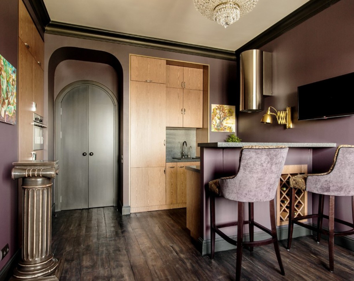
There is no separate dining room in this apartment, its role is performed by the living room. The coffee table, standing at the sofa, turns into a large dining table, for which you can seat ten people. “In small spaces, the struggle goes for every useful centimeter, so we made all the furniture to order and size,” says Natalia. “The design of conventional transformer tables leaves much to be desired, so I took a reliable German mechanism from a folding table, and our craftsmen made the wooden countertop and the forged base.”
SEE ALSO: House with a studio for the artist-illustrator
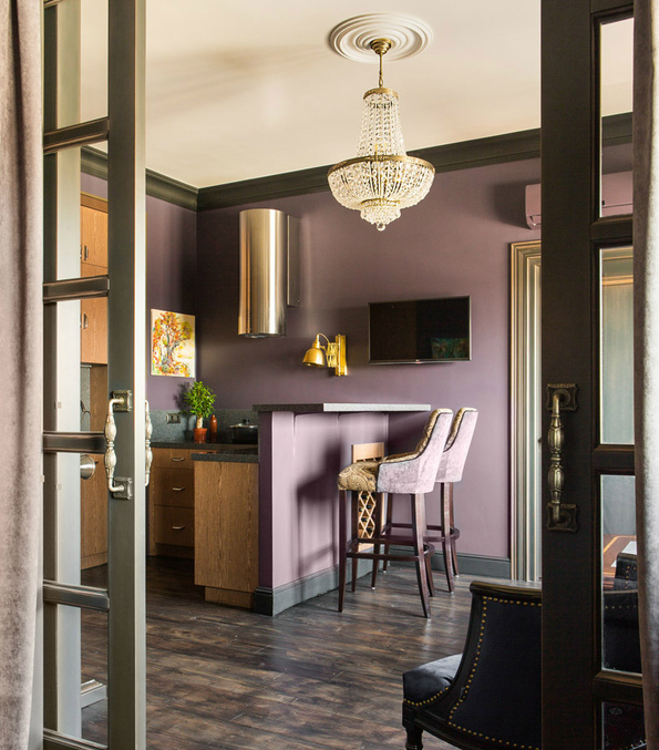
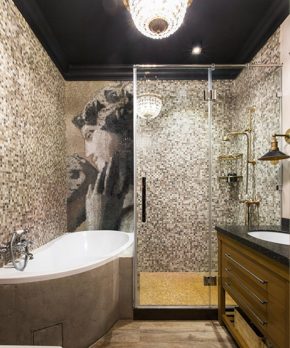
In general, the interior turned out to be eclectic. The landlady of the apartment took an active part in the work on it. “It’s amazing how it combines two hypostases: aristocratic and practical. The interior became a reflection of her character. We immediately decided that we would interfere with the pretentious classics with laconic things, “Natalia explains. “The walls of saturated colors, dramatic accents, a bit of kitsch – this is how we and the customer represent modern life.” Such elements of luxury as a vaulted ceiling in the hallway, mosaic panel in the bathroom and crystal chandeliers, are combined here with modern furniture and interior items with a touch of patina.
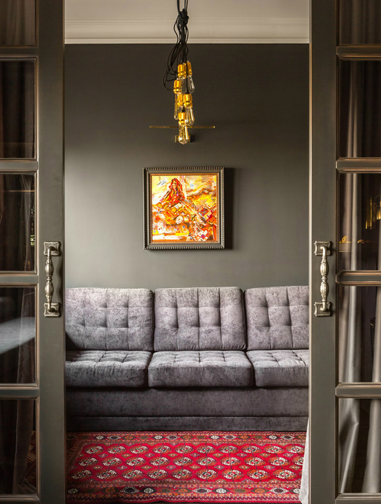
In addition to the three main rooms, a hallway and a bathroom, sixty-five meters away there was a place for three cloak-rooms and a closet. Where, by the way, are stored folding chairs, on which you can accommodate numerous guests. At first glance, this interior can not even be said that it hides in itself such opportunities.
SEE ALSO: Interior of a small apartment: 3 design myths
HOPE YOU LIKED OUR POST! FEEL FREE TO PIN ALL THE IMAGES TO YOUR FAVOURITE PINTEREST BOARD OR TO PRINT IT AND USE IN YOUR MOOD BOARD. FOLLOW US ON PINTEREST, TWITTER, SUBSCRIBE HERE AND DON´T MISS A SINGLE BREATH!


