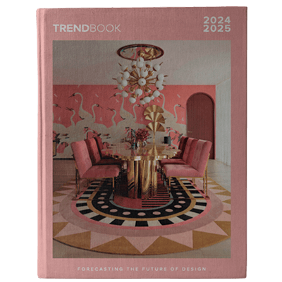
Summer color trends are painting the world with a vibrant new palette.
As the days grow longer and warmer, so too does our desire for fresh, inspiring hues. From the fashion runways to interior design trends, a captivating spectrum of colors is emerging. Join us as we explore the hottest summer color trends of the year and discover how to infuse your world with sunny sophistication.
SEE ALSO: Design Experts Pick The 55 Best Living Room Color Ideas
Hot Pink
According to trend forecasting agency WSGN’s director of interiors, Gemma Riberti, the hot pink hue first ushered in by Barbiecore is still holding strong. “Something surprising emerging from recent trade shows and latest launches is the presence of expressive brights,” Riberti notes. “The rise in global searches for ‘hot pink chair’ and ‘hot pink desk chair’ as a related query on Google Trends is an interesting example of how the appeal for high-octane colors is impacting interiors,” she continues. And those Google searches are onto something: The best way to use bright pink is as an accent—be it a chair, cushion, or picture frame.
EDITOR’S CHOICE


Radiant Red

Red is another standout bright this summer. “It is coming up in solid color applications both in apparel and in interiors,” Riberti says. Coincidentally, the hue had a viral moment on TikTok earlier this year, with design devotees preaching the virtues of “unexpected red theory”—the idea that if you add a red element to any interior it will automatically improve the space. The theory, which sounds simple enough, sparked thousands of hot takes and can be distilled down to color theory. (A pop of red will complement colors opposite and next to the hue on the color wheel—green, orange, and violet.) TikTok theories aside, it’s a classic yet playful shade, ensuring it will remain relevant in many seasons to come.
EDITOR’S CHOICE
Earthy Browns

According to experts, like Riberti, brown has taken center stage as a response to the current climate. “In times of uncertainty and upheaval, colors that are grounding, relatable, and dependable like greens and browns take the lead. Natural, nurturing, organic qualities become paramount to consumers, in apparel and in the home first and foremost,” she explains. Farrow & Ball’s color curator, Joa Studholme, agrees: “Browns feel earthy, warm and artisanal.”

While brown does connect us to nature, interior designers are also describing “quiet luxury brown” as the new neutral. “There’s been an evolution of how we work brown into contemporary interiors. We’ve seen an increased use of ‘brown furniture’ antiques, more millwork featuring natural wood tones, and even brown upholstery,” says interior designer Mandy Cheng. And paint companies are cashing in, with several new shades debuting this summer.
EDITOR’S CHOICE
Butter Yellow

Interior design influencer Shea McGee is shining a spotlight on butter yellow as the season’s must-have hue. Praising its sunny yet understated charm, McGee explains, “I love how relaxed it is without being overly bright.” This creamy, pale shade is popping up everywhere from wallpaper and paint to smaller accents like pillows and lamps, serving as a subtle yet effective mood booster. It’s a prime example of what Pinterest is calling “dopamine decor,” a trend that has seen a 280% increase in searches leading up to summer.
EDITOR’S CHOICE
Terra-cotta

Desert-inspired hues are heating up this summer. Terra-cotta, in particular, is a standout shade. “It provides a rich, earthy feel, popular in living rooms and outdoor spaces,” says interior designer Kate Marker. “Plus, it seamlessly bridges indoor and outdoor aesthetics.” Interior designer Rebekah Zaveloff agrees: “It’s reminiscent of a chic island resort,” she says. Incorporating terra-cotta hues through ceramics, soft fabrics, or painted walls can bring a touch of summer getaway bliss to everyday life.
EDITOR’S CHOICE
Rich Greens

Finally, deep, rich greens (think emerald) are making waves this summer. As noted by Riberti, green is similar to brown in that it is also a grounding color. But designers like that it has a bit more oomph. “Green feels like a sophisticated and discerning alternative to safer neutrals,” Zaveloff explains.
Studholme recommends Farrow & Ball’s Duck Green if you’re searching for a strong green. “It is unquestionably our smartest green, but feels strangely familiar like something from our childhoods while still retaining an element of sophistication,” she says.
EDITOR’S CHOICE
READ MORE: 7 Pink Sofa Living Room Ideas For A Warm Yet Bold Effect
For more irreverent design ideas with a vintage twist, don’t forget to follow Essential Home on Pinterest and Instagram. Subscribe to our newsletters here!


