
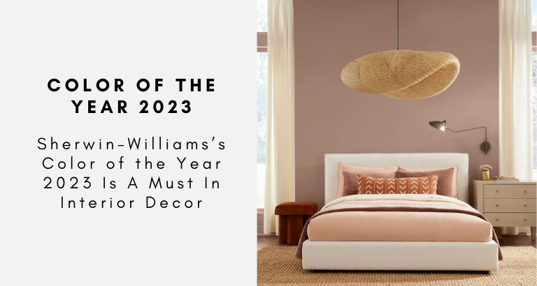
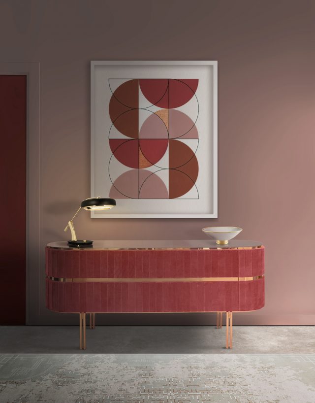
Leading paint brand Sherwin-Williams has revealed the 2023 Color of the Year- and we can’t help but fall in love with this blush, subtle, warm pink that will be stealing hearts next year! Redend Point SW 9081, part of Sherwin-Williams’s 2023 Colormix Forecast, is a warm, modern mauve that conjures a timeless elegance and is brimming with romance, without being extravagantly showy. Discover everything about Sherwin-Williams’s Color of the Year 2023!
SEE ALSO: COLOR THERAPY: GET GLOWING WITH BRIGHT AND NEON DESIGN IDEAS
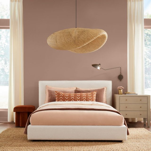
“It’s if beige could blush,” says Sue Wadden, the color marketing director at Sherwin-Williams. “It’s a pink-undertone neutral that is warm and earthy, and it has a certain softness and soothing quality to it that is really unique.”
The warm shade is a brave departure from the prior year’s cooler, more brooding tones, like 2022’s Evergreen Fog or 2021’s Urbane Bronze. Redend Point, which Sherwin-Williams describes as a “nostalgic mid-tone,” is pink-meets-gray-meets-beige.

“We know neutrals have reigned supreme for the past 10 years, but now we’re seeing different interpretations of these hues,” Wadden says. “People are embracing neutral versions of greens, blues, browns—all hues that help us feel grounded. And we felt that Redend Point really broadcast how color can be not only grounding but nurturing, reassuring, and familiar.”
In color psychology, pink is thought to be associated with love and romance, even tenderness and empathy. In design, it has shown to have a calming effect on people. In fact, sports teams have painted the opposing team’s locker pink to gain a pregame psychological advantage against opponents, as the color would make the players passive and less energetic. Aside from its nurturing associations, this soulful blush-beige also has roots in the natural world and in wellness.
Going beyond behaviorism, Sherwin-Williams’s decision to opt for this blushing hue is especially on point with our current moment. While bubblegum pink was the It color during the early 2000s, the rise of minimalism in design brought with it a new pink, a grown-up pink with a moodier, desaturated hue.
GET THE LOOK!

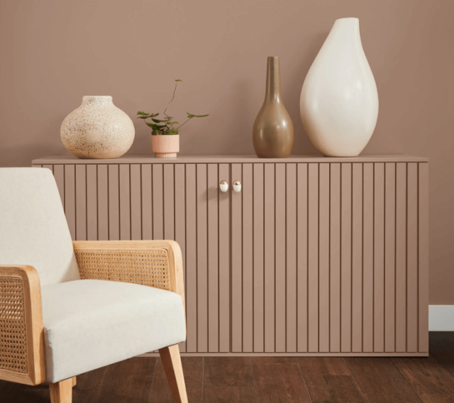
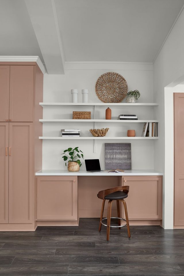
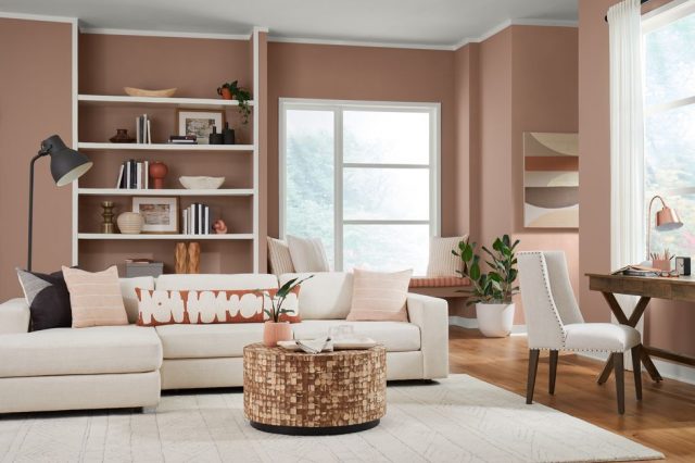
Wadden suggests pairing Redend Point with nature-inspired textiles, wood tones, metallic accents, or vintage accessories, which would really pop against this muted tone. Complementary green shades pair well with this hue. Rich reds, gentle greens, muted grays, and other earth tones offer eclectic color combinations. “I’m loving the pastoral vibe with teeny little floral prints and almost a 1980s pastoral farmhouse look, but a Shaker style,” she noted. “This color rocks with that.”
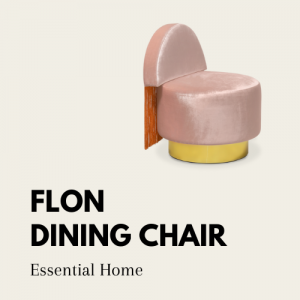
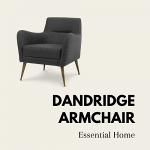
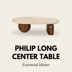
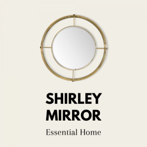
OUR SUGGESTIONS OF PIECES TO PAIR WITH REDEND POINT:


Whether you’re considering adding a touch of Redend Point detailing for your cozy reading corner, or have a hankering to go for a continuous three-wall-color situation, this year’s Color of the Year offers a little moment romantique for everyone.
READ MORE: FALL TRENDS 2022: OUR FAVORITE SEASONAL LOOKS FOR A FALL HOME
WE HOPE YOU LIKED OUR ARTICLE ON Sherwin-Williams’s Color of the Year 2023 Is A Must In Interior Decor. YOU CAN ALWAYS FOLLOW US ON THE GO! FIND US ON PINTEREST AND SHARE YOUR THOUGHTS WITH US!


