After eight months of greenery and three stunning color palettes for the Spring and Fall seasons, it is inevitable that we start thinking about the trends for the upcoming year. And while we still have a few more months left of Greenery, we can start planning out our home decor palettes, for Pantone has already announced some of their home and interior design palettes for the next year. These are the Pantone color trends for 2018, and you will love them…
RELATED: 2018 COLOR TRENDS: ROCKING A GREEN DECOR IN YOUR MID-CENTURY HOME

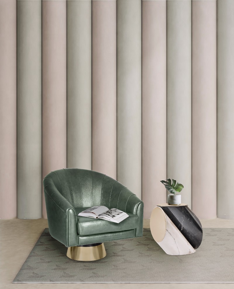
Photo © Pantone
It was earlier this year that during the International Home + Housewares Show that Pantone Color Institute executive director Leatrice Eiseman announced which colors trends and tendencies we can expect for the upcoming year of 2018. The great thing about it? It looks like it might have something for every taste and for everyone…
“Metallics we know are classic, but they have really moved over into neutrals,” Eiseman said at the event. She also predicts a continued infatuation with iridescence, since “the human eye can absolutely not avoid” anything pearlized or translucent.

We will also be seeing the decay of pastels as opposed to bright colors, which will most likely be everywhere in 2018. Intense colors are a little bit all over the eight colors palettes that were presented, so that is good news for every color lover.
“Intense colors seem to be a natural application of our intense lifestyles and thought processes these days,” said Eiseman.

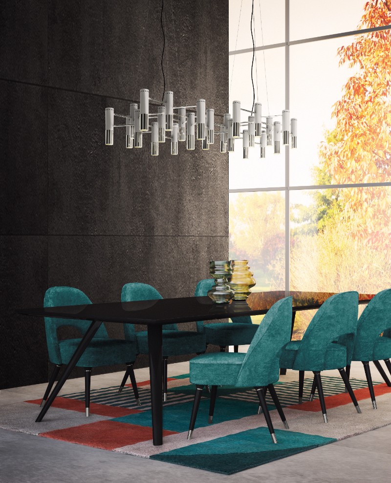
Photo © Pantone
And these are the 8 color palettes that, according to Pantone’s executive director, hold the trends for 2018:
Resourceful: A palette made up of complementary blue and orange colors. “This is quite an interesting color combination,” said Eiseman. “It combines warm and cool tones that you just can’t avoid looking at.”
Verdure: Vegetal colors like Celery are combined with berry-infused purples and eggshell blue, symbolic of health, in this palette.
Playful: Think “Minions.” Bright yellow, lime popsicle, and all other things fun come together for this color scheme. “People need to stop and smile,” said Eiseman.
Discretion: Playful’s alter ego. Subtle hues such as Elderberry and Hawthorne Rose offer a new sense of strength. “Pink has developed more power than ever before,” said Eiseman.
Far-fetched: With warm, earthy hues such as Cornsilk Yellow blending with rosy tones, this palette “reaches out and embraces many different cultures,” said Eiseman.
Intricacy: A palette of neutral metallics (AKA, the “new neutrals”) with accents of dramatic Holly Berry red and yellow Sulfur.
Intensity: This is an eclectic mix of colors that evoke a sense of strength, power, and sophistication, all balanced with black and gold.
TECH-nique: Bright turquoise, pink and purple colors anchored with Brilliant White and Frosted Almond nod to technology. This palette is all about hues “that seem to shine from within,” said Eiseman.
We can’t wait to see which will be the Color of the Year 2018!
KEEP READING: FIND OUT THE BEST WAY TO USE MILLENNIAL PINK IN YOUR MID-CENTURY HOME
WE HOPE YOU LIKED OUR ARTICLE. FEEL FREE TO PIN ALL THE IMAGES TO YOUR FAVORITE PINTEREST BOARD OR TO PRINT THEM TO USE IN YOUR MOOD BOARD. YOU CAN ALWAYS FOLLOW US ON THE GO! FIND US ON FACEBOOK, PINTEREST, INSTAGRAM OR SUBSCRIBE HERE AND DON’T MISS A SINGLE BREATH.