As they do for each season, Pantone has finally revealed their two fashion color palettes for the upcoming Fall and Winter seasons.
The color institute released this information a few days ago, after the New York and London Fashion Weeks, as per usual, and everyone is already loving the colors that walked this year’s runways in the two major cities. So, now it is time we take a look at the Pantone color palette that everyone seems to be talking about. At the end you will also find some suggestions on how you can use some of these colors in your home interiors.
RELATED: THESE 2018 COLOR TRENDS WILL BE BIGGER THAN MILLENNIAL PINK!
As you are probably aware, the Pantone Color Institute always comes up with two color reports, one for the New York Fashion Week, and another one for the London Fashion Week. Today we’re going to see them both and forecast what our home interiors will look like for the two upcoming seasons. Spoiler alert! We’re expecting a lot of strong colors and a return to the mid-century tones. But let’s take a look at the classic color palette, first…

Photo © Pantone Color Institute
The five shades that make the classic color palette make a steady foundation for your everyday wardrobe, as well as interiors. They are strong neutral colors that can easily be paired together with the other colors on the Fall Color Report.
“Our five core colors, easily worn across the seasons, are more crucial than ever.” Pantone

New York Color Palette
Both palettes are divided in the top 10 autumnal shades that rocked the runways, and an additional five neutral and more classic colors we have seen above. And these are the top 10 shades Pantone’s color experts spotted during the New York Fashion Week at the beginning of the month:
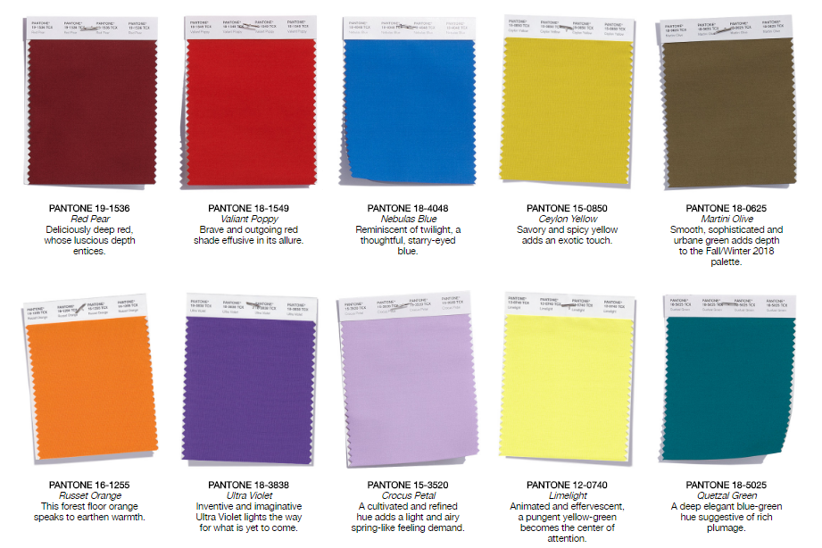
Photo © Pantone Color Institute
New York’s Fall color report is pretty much everything we could have hoped for. It boasts some of the most stunning autumnal tones and shades we already love such as Ultra Violet, Russet Orange, and Red Pear. Then, there is a feeling that reminds us of twilight and rich plumage, made possible by adding tones such as Crocus Petal, Limelight, and Valiant Poppy to the color palette.
London Color Palette
As for the London Fashion Week color report, instead of your usual 10 autumnal shades, Pantone has chosen 12 colors that really stood out in the runway. With a bit more flair, and some unexpected colors, these are the 12 colors that will rock our wardrobe when the Fall comes:
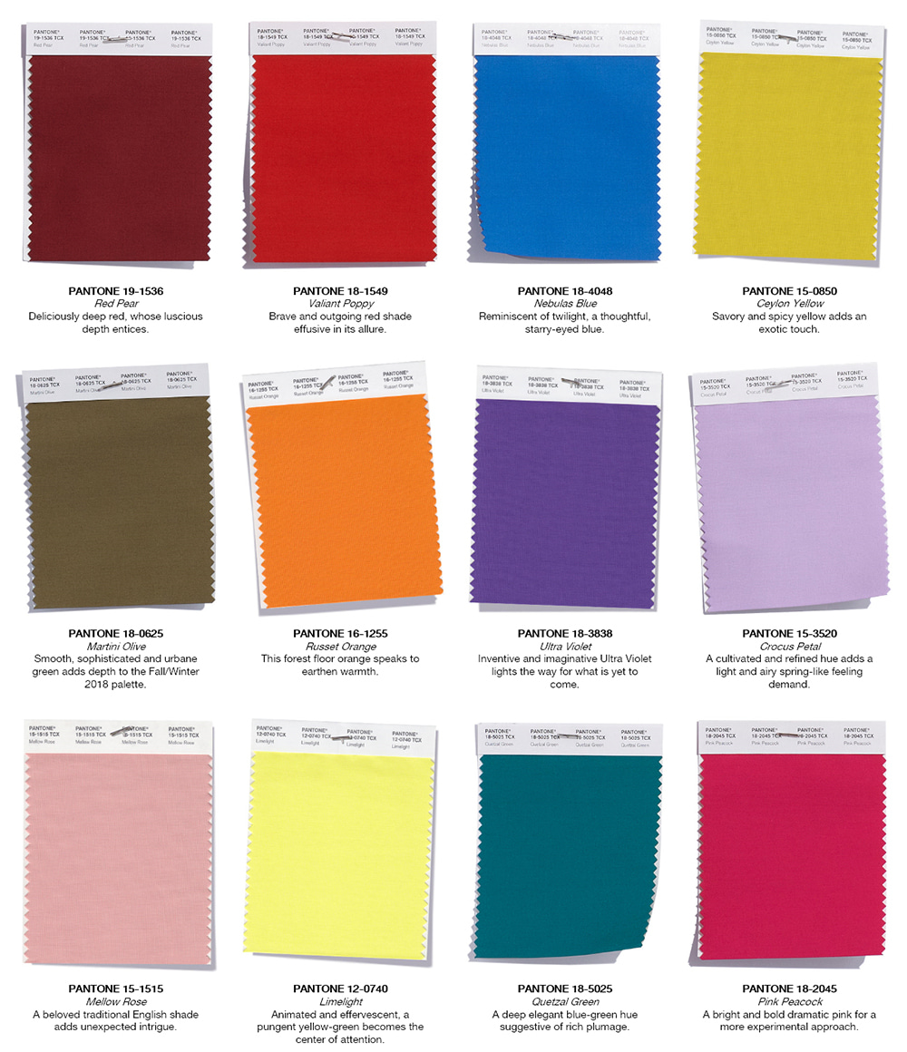
Photo © Pantone Color Institute
According to Pantone, this Fall’s color palette has more playful and colorful tones that will allow for more intriguing color combinations. Pink Peacock, Mellow Rose and Limelight are definitely three unexpected colors that happily made their way into this Fall/Winter Pantone colors. We can also spot our favorite Pantone Color of the Year, Ultra Violet, and some shades we were already expecting such as Quetzal Green, Martini Olive, and Red Pear.

Here are some items that will bring these Pantone color palettes into your home
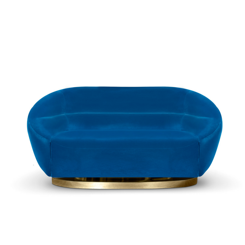
Mansfield sofa in Nebulas Blue.

Burton rug in Martini Olive.
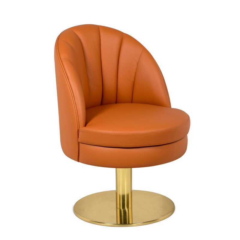
Gable dining chair in Russet Orange

Collins dining chair in Valiant Poppy
READ MORE: 9 BEDROOM COLOR SCHEMES FOR PEOPLE WHO LIKE TO KEEP IT TRENDY
WE HOPE YOU LIKED OUR ARTICLE. FEEL FREE TO PIN ALL THE IMAGES TO YOUR FAVORITE PINTEREST BOARD OR TO PRINT THEM TO USE ON YOUR MOOD BOARD. YOU CAN ALWAYS FOLLOW US ON THE GO! FIND US ON PINTEREST AND DON’T MISS A SINGLE BREATH.