

After having shared with you how you can stay trendy both indoors and outdoors with the New York Fashion Week color palette by Pantone, today we’re going to finish what we started. Remember how we only showed you the wonders of the first five colors of the palette? Today you will get to know the remaining five colors and the best ways to make them stand out in your Fall home decor, as well as your Fall wardrobe. You know the drill. So, let’s start with a quick recap!
SEE ALSO: USING RICH FABRICS & JEWEL TONES IN YOUR AUTUMN MID CENTURY FURNITURE
PANTONE’S FASHION COLOR REPORT
NEW YORK FASHION WEEK RECAP

For those of you who are still not aware that two amazing color palettes have been presented by Pantone for the upcoming season, let us present you the New York Fashion Week color palette. Filled with rich and earthy tones, which will be everywhere during the Fall, this color palette is a come back to the origins, with bold colors that remind us of the 1960s and 1970s. In other words, this couldn’t be a better color palette to be used both indoors and outdoors.
If you want to know more about these gorgeous choices by Pantone, make sure to read our previous article on the matter!
NEUTRAL GRAY

Neutral gray is probably one of the soberest and – obviously neutral – colors of the entire palette. It is a tone that brings the whole palette together and that balances it out with the other rich and strong shades. Indoors, it is very easy to use in more bold interiors, as it will definitely bring a sense of balance to the whole decor. Gable dining chair, pictured above, is proof of that.

SHADED SPRUCE
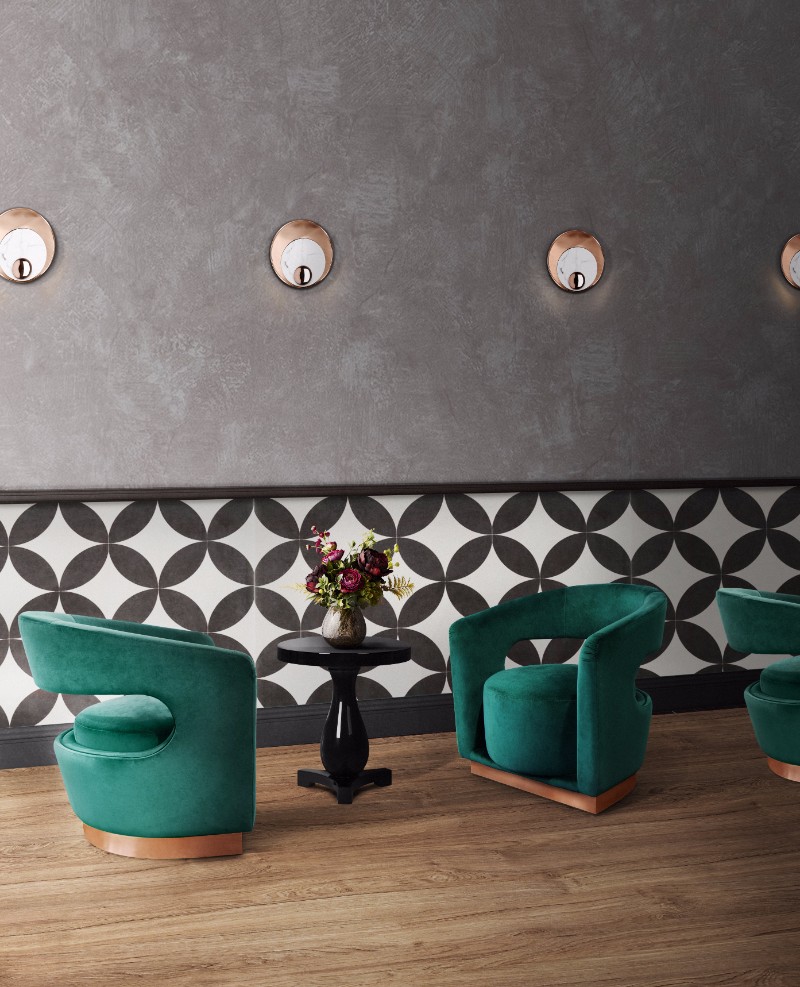
Shaded spruce is a dark and sophisticated shade of green, going a little bit further than the trendy Emerald green. It is a nice transition to the Fall and it will allow for all the green aficionados to make sure they can keep including this tone in their homes and wardrobe. Ellen armchair looks stunning in this particular color and we are obsessed with it!
GOLDEN LIME
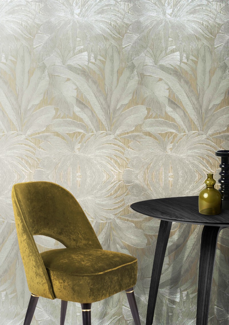
Golden lime is probably one of the most exotic shades of the whole palette. It works beautifully as a statement color and can be paired with other neutral colors such as Neutral Gray! See how this is all starting to come together? Collins dining chair looks just gorgeous in this shade!
MARINA
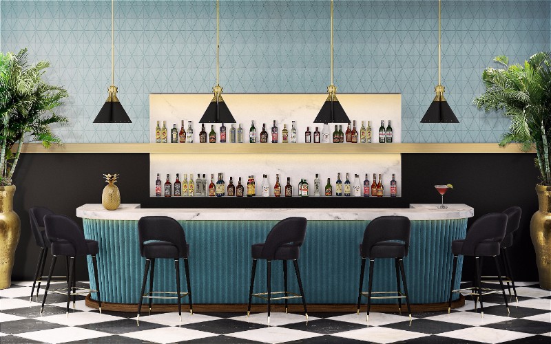
Another exotic color, Marina brings the best from the tropics into the Fall. It is a rich and cheery color that can easily brighten up any space and be paired with other statement colors, as well as multiple neutrals such as gray, white, beige… The black velvet upholstered Collins bar chairs create a great color blocking scheme with Marina.
AUTUMN MAPLE

The most Fall color of them all – for obvious reasons – Autumn Maple is an earthy tone which is very easy to mix with golden and brass elements. With a heavy mid-century feeling to it, Autumn Maple brings us back to the Palm Springs golden age with the tangerine tones that everybody loves. Look how stunning those Loren armchairs look in this particular shade!
KNOW MORE!
Pay close attention to our infographic below and learn how to stay trendy indoors and outdoors this Fall! Below you will find the remaining five Pantone Fall Colors that were missing from the previous post and tips on how to use them in your mid-century furniture, as well as, how to incorporate them in this Fall fashion trends!

KEEP READING: 5 TIPS ON HOW TO USE MID-CENTURY MODERN SIDE TABLES AND CENTER TABLES
WE HOPE YOU LIKED OUR ARTICLE. FEEL FREE TO PIN ALL THE IMAGES TO YOUR FAVORITE PINTEREST BOARD OR TO PRINT THEM TO USE IN YOUR MOOD BOARD. YOU CAN ALWAYS FOLLOW US ON THE GO! FIND US ON FACEBOOK, PINTEREST, INSTAGRAM OR SUBSCRIBE HERE AND DON’T MISS A SINGLE BREATH.


